Categories more
- Adventures (17)
- Arts / Collectables (15)
- Automotive (37)
- Aviation (11)
- Bath, Body, & Health (77)
- Children (6)
- Cigars / Spirits (32)
- Cuisine (16)
- Design/Architecture (22)
- Electronics (13)
- Entertainment (4)
- Event Planning (5)
- Fashion (46)
- Finance (9)
- Gifts / Misc (6)
- Home Decor (45)
- Jewelry (41)
- Pets (3)
- Philanthropy (1)
- Real Estate (16)
- Services (23)
- Sports / Golf (14)
- Vacation / Travel (60)
- Watches / Pens (15)
- Wines / Vines (24)
- Yachting / Boating (17)
Published
10/10/2020 by Affinity Creative GroupWhat do you do when your greatest asset is hiding under a glacier? That's what the management team at Anchorage Distillery wanted to know, so they called Affinity Creative Group to reveal and revitalize their brand.
Johnny McCormick, CEO, Anchorage Distillery, commented, "The Affinity team has a winning approach to the creative process. Rather than dive straight into label concepts and bottle shapes, we started with the essential questions: What makes our Alaskan spirits unique? What elements of our distillery's Alaskan identity do we want to convey?"
Affinity, a creative agency for wine, spirits, and other luxury products, based on Mare Island, CA, was retained to completely re-imagine the Anchorage Distillery offering—beginning with re-establishing its brand essence. The teams first assembled to identify the desired brand attributes, personality, and market positioning. With the brand profile in place, Affinity went to work in transforming the dated look of the existing product line.
The goal was to create packaging with a hand-made, customized, and specialty-crafted look and feel that conveys Alaska's authentic and adventurous spirit.
"We were impressed with the way Affinity's designers translated our answers into a diverse set of initial label concepts. From there, we chose the creative direction we wanted to pursue and partnered closely with the Affinity team as they refined the chosen concept into a beautiful final product," CEO McCormick remarked.
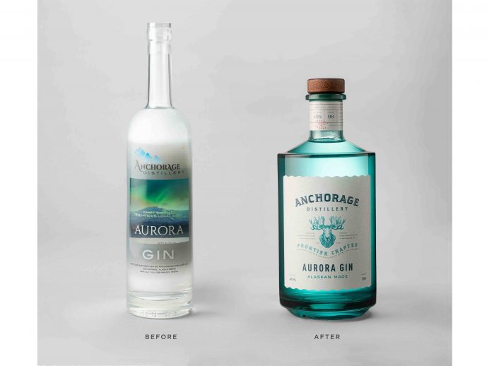
The new Anchorage Distillery logo projects authenticity and achieves strong brand registration on a crisp, white, textured label stock. The additional unique engraving of an Alaskan Moose emphasizes a rugged and robust brand spirit. Every detail imaginable was addressed. From the finely detailed 'tax-stamp' look of the neckbands to the rippled, die-cut labels, suggestive of the Alaskan water's edge.
Affinity's design solution is a mix of various elements—artisan, organic in feel, and distinctive. The creative agency also recommended new glass bottle structures more aligned with the brand's personality. For instance, The Aurora Gin translucent-colored glass effect is unique. Inspired by the aurora borealis and Alaska's dramatic, undulating-blue waters, the new bottle structure now underscores the brand's origin. Additionally, the switch from transparent closures to wood stoppers delivers a sophisticated, yet down to earth, craft vibe for the entire product line.
In addition to Aurora Gin, a range of Vodkas, Roadhouse Rye (a clear un-aged whiskey), and a new, Single Barrel Release, Straight Rye Whiskey, round out the re-launched brand family.
This revolutionary redesign for Anchorage Distillery truly captures the spirit of Alaska. Authentic, all-natural, and handcrafted — right on the bottle.


