Categories more
- Adventures (17)
- Arts / Collectables (15)
- Automotive (37)
- Aviation (11)
- Bath, Body, & Health (77)
- Children (6)
- Cigars / Spirits (32)
- Cuisine (16)
- Design/Architecture (22)
- Electronics (13)
- Entertainment (4)
- Event Planning (5)
- Fashion (46)
- Finance (9)
- Gifts / Misc (6)
- Home Decor (45)
- Jewelry (41)
- Pets (3)
- Philanthropy (1)
- Real Estate (16)
- Services (23)
- Sports / Golf (14)
- Vacation / Travel (60)
- Watches / Pens (15)
- Wines / Vines (24)
- Yachting / Boating (17)
Published
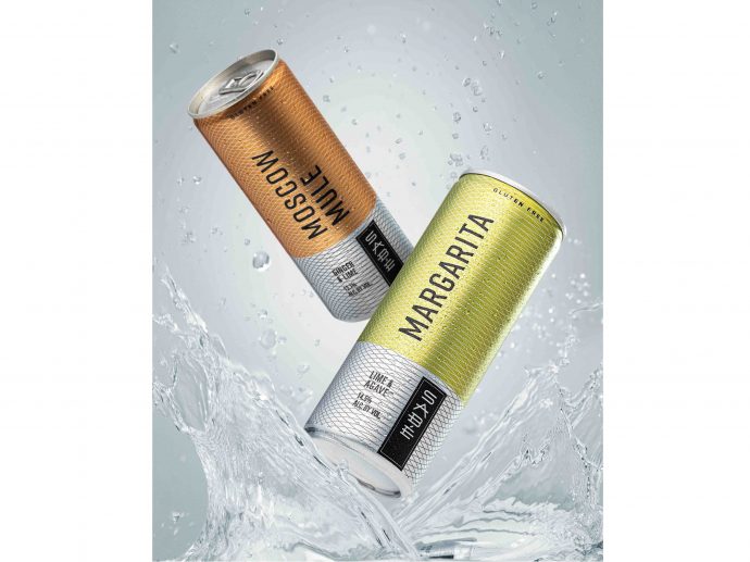
07/30/2020 by Affinity Creative GroupAfter successfully launching a highly acclaimed line of tequila, bourbon and vodka blends, what do you do for an encore? For the producers of SABÉ, the answer was obvious: launch convenient, pre-mixed full-strength cocktails that are all-natural and gluten free and package them in 250mL sleek cans.
Affinity Creative Group, the creative agency behind the look and feel of the core line of SABÉ offerings was tasked with developing a sophisticated, stylish and premium image, while building brand equity, communicating flavor and accommodating a new, more accessible can format.
The design, using precise concentric arcs, conveys the crisp and clean taste of these new offerings. A muted yet appetizing color palette suggests bright, refreshing flavors and differentiates the first three cocktail offerings in the portfolio, which await the arrival of two more expressions. The powerful SABÉ wordmark carries over from the flagship glass bottle labels, to brand and connect the two product lines.
Jim Andrews, founder, CEO and the force behind SABÉ, praised the Affinity team for their efforts in bringing the canned cocktail concept to life: "There were a lot of challenges to get this done in such a limited space. The Affinity Creative team not only translated the vision for this product line, they arrived at a packaging design solution beyond what I imagined. Their design is not only attractive and appealing, but it is also creative and effective. The reception to the line has been phenomenal. It has already captured the attention of distributors and retailers, which in today's world is not easy to do. If the trade is this enamored with the concept and design, I can't wait to see consumers discover the brand."


