Categories more
- Adventures (17)
- Arts / Collectables (14)
- Automotive (37)
- Aviation (11)
- Bath, Body, & Health (77)
- Children (6)
- Cigars / Spirits (32)
- Cuisine (16)
- Design/Architecture (22)
- Electronics (13)
- Entertainment (4)
- Event Planning (5)
- Fashion (45)
- Finance (9)
- Gifts / Misc (6)
- Home Decor (45)
- Jewelry (41)
- Pets (3)
- Philanthropy (1)
- Real Estate (16)
- Services (23)
- Sports / Golf (14)
- Vacation / Travel (59)
- Watches / Pens (14)
- Wines / Vines (24)
- Yachting / Boating (17)


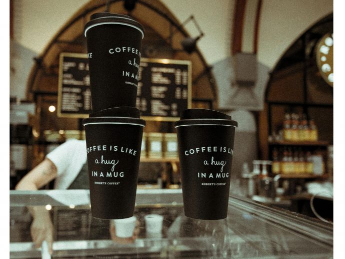
How Do You Match Custom Disposable Coffee Cups to Your Brand Colors?
Published
07/16/2025Brand consistency extends far beyond logos and websites. Every touchpoint with customers presents an opportunity to reinforce your visual identity, including the humble coffee cup. When customers hold your beverage container, they're experiencing your brand in a tangible way that creates lasting impressions.
Color matching represents one of the most critical aspects of successful branding. The right hues can evoke emotions, trigger memories, and strengthen brand recognition. Custom Disposable Coffee Cups offer a unique canvas to showcase your brand colors while serving a practical purpose. This blog explores the essential strategies for achieving perfect color alignment between your brand identity and disposable coffee cups.
Understanding Color Psychology in Branding
Red energizes and creates urgency, while blue builds trust and reliability. Green suggests freshness and sustainability, whereas black conveys sophistication and premium quality. Understanding these psychological associations helps you select colors that align with your brand personality and target audience expectations. Primary colors should dominate the cup design, while secondary colors can accent specific elements.
Selecting the Optimal Printing Technique
Different printing techniques offer varying levels of color accuracy and durability. Digital printing provides excellent color reproduction for complex designs with multiple hues, making it ideal for brands with detailed logos or gradient elements. Screen printing works well for solid colors and simple designs, offering vibrant results at competitive costs. Heat transfer printing allows for photographic quality images and precise color matching. Flexographic printing suits large volume orders with consistent color requirements.
Material Selection and Color Compatibility
Paper cup materials significantly impact color appearance and vibrancy. Coated papers provide smooth surfaces that enhance color saturation and sharpness. Uncoated materials create a more natural, textured appearance but may cause colors to appear slightly muted. Consider the cup's base color when planning your design. White backgrounds allow colors to appear true to their original form, while colored or kraft backgrounds create different visual effects.
Design Considerations for Color Harmony
Effective color schemes follow established design principles. Monochromatic schemes use different shades of the same color family, creating subtle sophistication. Complementary colors sit opposite each other on the color wheel, generating dynamic contrast that catches attention. Analogous colors neighbor each other on the color wheel, producing harmonious and pleasing combinations.
Testing and Approval Process
Color accuracy requires thorough testing before production. Request physical samples that demonstrate how your colors will appear on actual cup materials. Digital proofs on computer screens cannot accurately represent final printed results due to differences between RGB and CMYK color spaces.
- Examine samples under different lighting conditions
- Compare samples to your brand color standards
- Test color consistency across different batch productions
- Verify color durability through handling and moisture exposure
- Ensure colors remain vibrant throughout the product lifecycle
Coffee Sleeve Solutions for Brand Color Matching
Coffee sleeves offer an excellent alternative for businesses seeking cost-effective brand color implementation. These protective paper wraps provide substantial surface area for brand display while requiring lower minimum order quantities compared to custom cups. The same color matching principles apply when working with sleeve manufacturers who utilize offset printing technology for precise color reproduction. Coffee sleeves present several advantages for brand color consistency.
Quality Control and Consistency
Maintaining color consistency across multiple orders requires established quality control procedures. Work with suppliers who understand color matching standards and can provide detailed color specifications. Document approved color formulas for future reference and reordering. Regular quality checks during production ensure colors meet your standards. Address any variations immediately to prevent entire batches from falling short of expectations.
Matching Custom Disposable Coffee Cups to your brand colors requires careful planning, appropriate material selection, and rigorous quality control. Success depends on understanding color psychology, choosing suitable printing methods, and maintaining consistency across all applications. When executed properly, branded coffee cups become powerful marketing tools that reinforce your identity with every sip customers take.
Comments
