Categories more
- Adventures (17)
- Arts / Collectables (14)
- Automotive (37)
- Aviation (11)
- Bath, Body, & Health (77)
- Children (6)
- Cigars / Spirits (32)
- Cuisine (16)
- Design/Architecture (22)
- Electronics (13)
- Entertainment (4)
- Event Planning (5)
- Fashion (45)
- Finance (9)
- Gifts / Misc (6)
- Home Decor (45)
- Jewelry (41)
- Pets (3)
- Philanthropy (1)
- Real Estate (16)
- Services (23)
- Sports / Golf (14)
- Vacation / Travel (59)
- Watches / Pens (14)
- Wines / Vines (24)
- Yachting / Boating (17)
Published
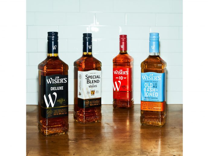
11/11/2023 by Corby Spirit and Wine CommunicationsLegendary Canadian whisky producer J.P. Wiser's is always raising the bar. With a legacy spanning over 165 years, the iconic brand has been a leader in the Canadian Whisky category since its inception, thanks to its intricate distilling process, smooth style, and unparalleled creations. And now, it's charging forward with a transformation that celebrates its Canadian heritage, while giving it a bold new look.
"At J.P. Wiser's, we take pride in our rich history which has helped guide the brand's evolution and solidified its status as an industry leader," says Caroline Begley, Vice President of Marketing, Corby. "With this design refresh, we've focused on shining a light on the heritage J.P. Wiser's has established since 1857, all the while giving it a modern and distinctive look. To do this, we took inspiration from our founder, embodying J.P.Wiser's spirit of self-assurance, boldness and authenticity."
The iconic whisky brand has partnered with international design agency JDO to create a new and revitalized image, while retaining the same perfectly-balanced flavour profiles whisky lovers have come to know and appreciate. The brand refresh exudes simplicity and confidence, with an updated logo that features modern typography and a colour palette that pays homage to the brand's industrial origins. This is coupled with two new brand symbols, a big "W" that will be a common thread in the J.P. Wiser's family, and an icon of a horse rearing over a barrel, a nod to the brand's illustrious past and a tribute to the J.P. Wiser's quote: "Horses Should Hurry But Whisky Must Take Its Time."
"With this modern refresh, J.P. Wiser's brand continues to reach new heights," adds Begley. "We're looking forward to continuing our journey on providing the most authentic whisky experience, one that doesn't need you to impress anyone but yourself. So, sit back, relax, and indulge in a classic. That's what we call wisely done."


