Categories more
- Adventures (17)
- Arts / Collectables (14)
- Automotive (37)
- Aviation (11)
- Bath, Body, & Health (77)
- Children (6)
- Cigars / Spirits (32)
- Cuisine (16)
- Design/Architecture (22)
- Electronics (13)
- Entertainment (4)
- Event Planning (5)
- Fashion (45)
- Finance (9)
- Gifts / Misc (6)
- Home Decor (45)
- Jewelry (41)
- Pets (3)
- Philanthropy (1)
- Real Estate (16)
- Services (23)
- Sports / Golf (14)
- Vacation / Travel (59)
- Watches / Pens (14)
- Wines / Vines (24)
- Yachting / Boating (17)


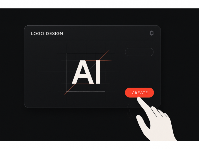
Speed Test: Can You Create a High-Quality Logo in 5 Minutes with AI?

Published
07/06/2025Deadlines. Budgets. Launch days. If you’re running a startup or freelance brand, chances are you’ve felt the pressure of needing everything — including a logo — done yesterday. And while the idea of building a brand identity in just five minutes might sound like a stretch, AI tools are challenging the rules of design speed.
Logos are more than decoration. They anchor your identity, help customers recognize your product, and set the tone for every interaction. A weak logo? It’s like walking into a meeting in mismatched shoes.
In this article, we’ll explore whether AI can truly deliver quality at speed. You’ll learn:
- The step-by-step process of testing AI design under time pressure
- How to keep quality high even when moving fast
- The pitfalls to avoid in rapid-fire branding
- Real examples and smart tweaks to elevate your AI results
Ready to see how fast and good your logo can get? Let’s dive in…
1. Set Your Brand Foundation Before the Timer Starts
Before you hit “generate,” clarity is your greatest asset. In rapid design sessions, vague inputs lead to generic outputs. That’s why defining your brand personality first is crucial — even if it only takes 2 minutes.
Picture this: you're launching a sustainable coffee brand. You want earthy tones, calm energy, and a modern serif font. That’s all it takes to guide the AI in the right direction.
Actionable tip: Write down 3–5 brand traits (e.g., bold, minimalist, playful) and 1–2 visual cues (e.g., green palette, abstract icon). Keep them visible as you work.
Don’t be afraid to think small — a little direction goes a long way in design.
2. Choose the Right Tool for the Job
Not all AI logo makers are created equal. Some prioritize style, others speed, and some (like Turbologo) offer flexible customizations without slowing you down.
If you're aiming to create a polished logo in five minutes, pick a platform that minimizes clutter and streamlines the process.
Actionable tip: Test the tool beforehand. See how many steps are required to export a logo and whether customization is intuitive or hidden behind menus.
Pro Tip: Keep your visual identity consistent across all channels — from website headers to Instagram highlights. A good tool will provide brand kits to help you stay uniform.
3. Pick a Style and Stick with It
In fast-paced design, indecision is your enemy. When AI gives you multiple options, it’s tempting to second-guess — but trust your instinct. Consistency trumps variety.
Let’s say your brand is tech-forward. Choose a clean, sans-serif font and geometric iconography — and resist the urge to “try something fun” halfway through.
Actionable tip: Lock your brand voice before designing. Is it sleek and modern? Playful and warm? This will guide your aesthetic decisions.
Remember that your logo sets the tone. Pick one voice and stick with it.
4. Customize, Don’t Over-Design
Speed doesn’t mean sloppiness — but it also doesn’t require perfection. Aim to make 1–2 meaningful adjustments to the AI output. This creates a sense of ownership without getting bogged down in endless edits.
Imagine an AI-generated icon looks decent, but the font feels off. Swap in a modern, all-caps font. Done. Now it’s yours.
Actionable tip: Prioritize edits that affect recognition — like font style and symbol alignment — rather than tiny spacing tweaks.
Bold move: Save multiple versions quickly. Then come back later with fresh eyes.
5. Use Color Psychology to Make an Instant Impression
In a 5-minute design sprint, colors do the heavy lifting. They’re emotional triggers — signaling energy, trust, innovation, or creativity in seconds.
Dropbox uses soft blues to evoke calm and professionalism. Spotify’s green suggests freshness and energy. Airbnb’s pinkish tone brings warmth and humanity.
Examples of Creative Logo Approaches: Spotify, Dropbox, Airbnb
Actionable tip: Choose a palette that aligns with your core emotion. Blue for trust, green for growth, yellow for optimism. Avoid mixing too many hues.
Colors are your silent brand ambassadors. Treat them like strategy, not decoration.
6. Check Scalability and Versatility
Even if you’re rushing, your logo has to work at any size. What looks great on screen might vanish on a business card or app icon.
If your logo includes thin lines, complex shading, or excessive text, simplify. Fast design shouldn’t ignore function.
Actionable tip: Test your design in black and white, as a 32x32 favicon, and on a mockup like a tote bag or mobile app screen. Most AI tools let you preview.
Pro Tip: Simpler is smarter when you’re designing fast. Bold lines, clear fonts, and minimal detail travel better across formats.
7. Add a Touch of Personality
Here’s where speed meets soul. AI is fast — but it can feel sterile. If time allows, add a detail that reflects your unique brand spirit.
Maybe it's a hidden symbol in your icon. Maybe it's an offbeat color choice. Even a slight curve in a letter can become a recognizable signature.
Actionable tip: After your base logo is done, take one minute to add or tweak something personal. This extra touch can make your brand more memorable.
This is where create a logo with AI becomes more than automation — it becomes creative acceleration.
8. Evaluate Fast, Improve Later
Done is better than perfect — at first. But before sharing your new logo with the world, take a moment to reflect. Is it on-brand? Can you explain why you chose it?
Many startups use AI logos as a temporary solution, then refine later as they grow. That’s not failure — it’s evolution.
Actionable tip: Use your AI logo for MVP launches, internal documents, or pitch decks. Gather feedback. Iterate when time and budget allow.
Design is a living part of your brand. Let it grow with you.
Conclusion
Creating a high-quality logo in just five minutes with AI? It’s absolutely possible — if you prepare smartly, focus your decisions, and aim for clarity over complexity. In today’s fast-moving business world, speed is power — and AI gives you that edge without sacrificing impact.
Remember: your logo doesn’t have to be perfect on day one. But it does have to be intentional.
Comments
