Categories more
- Adventures (17)
- Arts / Collectables (14)
- Automotive (37)
- Aviation (11)
- Bath, Body, & Health (76)
- Children (6)
- Cigars / Spirits (32)
- Cuisine (16)
- Design/Architecture (22)
- Electronics (13)
- Entertainment (4)
- Event Planning (5)
- Fashion (45)
- Finance (10)
- Gifts / Misc (6)
- Home Decor (45)
- Jewelry (41)
- Pets (3)
- Philanthropy (1)
- Real Estate (16)
- Services (23)
- Sports / Golf (14)
- Vacation / Travel (59)
- Watches / Pens (14)
- Wines / Vines (24)
- Yachting / Boating (17)


Top 6 Visual Illusions You Can Create with Peony Floral Wallpaper
Published
03/16/2026Peony floral wallpaper can do more than “decorate”. With the right scale, color, and placement, it can stretch a room, lift a ceiling line, or make a space feel more intimate. This guide breaks down six practical illusions you can create with peony wallpaper designs, plus simple checks to help you choose confidently.
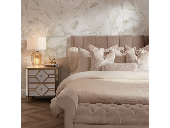
1. Making Small Rooms Feel Larger with Large-Scale Peony Patterns
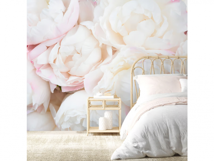
Soft Blushing Peony Wallpaper Mural – Wallhue
Small rooms often look busier than you intend, especially with tiny repeats. A large-scale floral wallpaper peony print can calm the wall because the eye reads the blooms as a few big shapes, not hundreds of details. That reduction in “visual chatter” makes tight rooms feel more open and intentional.
Why Oversized Peonies Expand Visual Space
Oversized blooms reduce pattern repetition. Fewer repeats create a calmer rhythm. The wall feels like one large artwork instead of a textured background. If you want a clean look with minimal styling, this approach helps.
Best Peony Scales for Compact Spaces
Look for big blooms with plenty of breathing room. Light grounds help, especially in rooms with limited daylight. In most small spaces, one accent wall works best. Full coverage can feel immersive, but it can also feel close if contrast runs high.
2. Adding Height to Low-Ceiling Rooms with Vertical Peony Arrangements
If a room feels squat, you can shift the visual “pull”
3. Creating Depth and Dimension with Layered Peony Designs
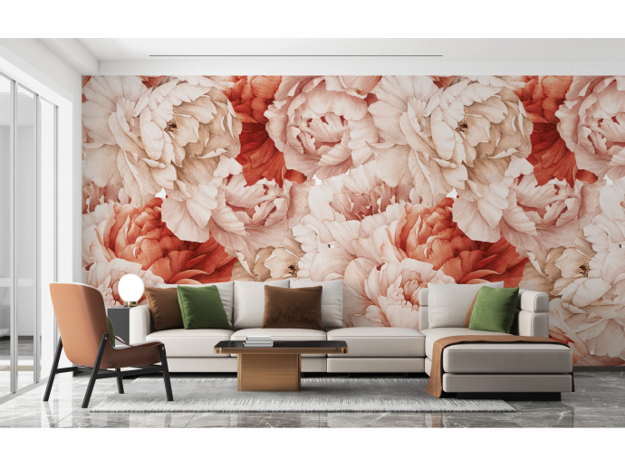
Shameless Peonies Florals Peel and Stick Wallpaper Murals – Giffywalls
Layered florals can create a strong, dimensional floral wallpaper effect. The trick is depth cues. Overlap, shadow, and soft focus make the wall feel like it has distance, not just pattern.
Using Foreground and Background Peonies
Look for prints where some blooms feel closer than others. Foreground petals look sharper. Background blooms look softer or lighter. That layered composition gives the wall a subtle 3D read, especially in side lighting.
Tonal Variation for Maximum Depth
Depth improves when tones step gradually from light to dark. Watercolor peonies often excel here because they blend edges naturally. Photoreal prints can work too, but they can highlight wall flaws if the finish is shiny.
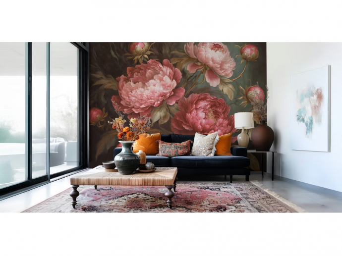
4. Making Rooms Feel More Intimate with Dark Peony Wallpaper
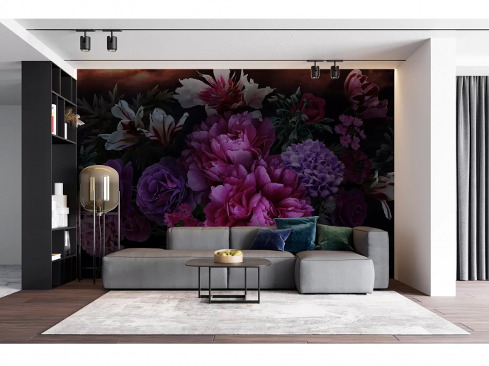
Wall Murals Flowers Bouquet of magnificent peonies – Uwalls
Dark grounds can make a room feel cocooned. Used carefully, they create intimacy instead of heaviness. This is one of the strongest floral wallpaper visual effects when you want a space to feel enveloping.
How Dark Backgrounds Reduce Visual Space
Deep navy, charcoal, and near-black push the walls inward visually. That can feel cozy in bedrooms, dining rooms, and powder rooms. Lighting matters more than usual. Add warm lamps and avoid harsh overhead glare.
Peony Colors That Work on Dark Backgrounds
Blush, ivory, and soft coral peonies read beautifully against dark grounds. Keep metallic accents subtle. Too much shimmer can create glare and flatten the artwork.
5. Blurring Wall Boundaries with Tonal Peony Wallpaper
Vintage Peony Full Wall Mural in Cool Neutrals – I Love Wallpaper
Tonal peonies can soften edges. When contrast stays low, the wall reads like atmosphere, not a hard plane. This is a great option when you want the room to feel gentle and “continuous.”
Monochromatic Peony Pattern Wallpaper for Seamless Walls
Tone-on-tone peonies create texture without sharp breaks. Walls can feel farther away because the eye does not catch strong contrast points. This effect also plays well with minimal furniture.
Best Color Combinations for Subtle Effect
Soft cream on cream works in low-light rooms. Dusty pink on warm blush feels flattering and calm. Gray-on-gray can look modern, but it needs warm lighting so it does not turn cold. A matte finish usually supports the soft-edge look.
6. Creating Movement and Energy with Flowing Peony Compositions
Vintage Red Peonies Wallpaper – Happywall
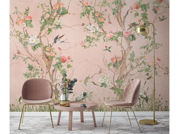
If a room feels static, choose a design with motion. Flowing peonies can guide the eye and add energy, even in calm palettes. This is one of the most versatile peony wallpaper ideas for hallways, entry walls, and living rooms.
Dynamic Peony Arrangements That Guide Eye Movement
Diagonal placements feel lively. Curved stems feel graceful. Avoid grid-like spacing if you want movement. A mural-style layout often works better than a tight repeat for this effect.
Directing Attention to Focal Points
Use flow to aim the eye where you want it. That could be a fireplace, a headboard, or a window wall. When the composition “leans” toward a focal point, the room feels composed on purpose.
Choosing the Right Peony Wallpaper for Your Desired Effect
A quick way to decide is to match the illusion to how the room should feel. Large blooms often suit small rooms that need calm. Vertical layouts help with low ceilings. Dark grounds add intimacy. Tonal designs blur boundaries. Layered compositions boost depth. Flowing layouts add motion.
Matching the Illusion to the Room Function
Bedrooms often benefit from tonal or dark peonies. Living rooms handle a bolder scale and movement. Dining rooms look dramatic with deep grounds and controlled lighting. For nurseries, stick to softer contrast and breathable spacing. If you want peony wall murals, treat them like art. Keep nearby decor simpler.
Testing Before Committing
Order a sample if you can. Check it in morning light and lamplight. Step back to your normal viewing distance. Then check again up close. That last step matters with peony print wallpaper, since the petal detail can read “busy” at short range. If you plan a feature wall, tape the sample at eye level first. That small test prevents most regrets.upward. Vertical peony layouts do that naturally. Think stems that rise, blooms that stack, and spacing that guides your gaze from baseboard to ceiling.
How Vertical Floral Placement Draws Eyes Upward
A vertical composition creates upward movement. That movement reads as height, even when the ceiling stays the same. Avoid layouts where blooms sit in horizontal rows. Those can make the room feel wider, not taller.
Optimal Pattern Layouts for Height Illusion
Choose designs with a top-to-bottom flow. Look for stems, trailing branches, or a mural layout that climbs. Keep the ceiling simple. A bright white ceiling often strengthens the height effect.
Comments
