Categories more
- Adventures (17)
- Arts / Collectables (14)
- Automotive (37)
- Aviation (11)
- Bath, Body, & Health (76)
- Children (6)
- Cigars / Spirits (32)
- Cuisine (16)
- Design/Architecture (22)
- Electronics (13)
- Entertainment (4)
- Event Planning (5)
- Fashion (45)
- Finance (10)
- Gifts / Misc (6)
- Home Decor (45)
- Jewelry (41)
- Pets (3)
- Philanthropy (1)
- Real Estate (16)
- Services (23)
- Sports / Golf (14)
- Vacation / Travel (59)
- Watches / Pens (14)
- Wines / Vines (24)
- Yachting / Boating (17)


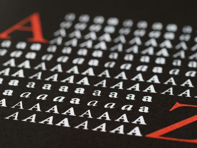
Typography Mistakes That Ruin Great Designs And How to Fix Them Fast?
Published
04/30/2026Great design does not fail because of colors or layouts but typography errors do. You may create an aesthetically pleasing interface but once people find that it is hard to read or scan your work, the impact of your design is lost immediately. Typography helps you build a perception of your brand, relate to your content and choose to remain or go.
Research indicates that almost 75% of users make their judgments about the credibility of a brand by focusing on the visual design and typography is the most important part of that judgment. The good news? Most typography mistakes are corrected after knowing what to look out of. We will break down the most common mistakes and the way you can correct them in a very little time.
Why is Typography important in Design?
Typography is not mere words on a screen but it is tone, it helps in making you feel trusted and it gives the user a direction of what you are saying. When well implemented, it can improve the usability and can streamline the user experience. It is very confusing and frustrating when done incorrectly.
Strong typography helps you:
- Improve readability and content flow
- Build a professional brand identity
- Increase engagement and conversions
- Reduce bounce rates
Bad typography interferes with the users behaviour. Users are rapidly scanning the material and therefore the clarity and structure are of more importance than ever.
Quick Overview of Common Typography Mistakes
|
Mistake |
Impact |
Quick Fix |
|
Too many fonts |
Confuses users |
Use 2–3 fonts max |
|
Poor spacing |
Hard to read |
Increase line height |
|
Bad contrast |
Low visibility |
Use high contrast colors |
|
Ignoring hierarchy |
No flow |
Use size & weight |
10 Typography Mistakes and How to Fix Them
1. Using Too Many Fonts
A combination of different fonts is a visual mess. It undermines the consistency and distracts your message to the users.
Fix: Use two or three fonts that complement each other. Use them in headings and another in body.
2. Ignoring Visual Hierarchy
With all text being identical, the user is not aware of where to pay attention.
Fix: font size, weight and spacing to direct attention. Headings ought to be noticeable.
3. Poor Line Spacing (Leading)
The text is tightly spaced together to make it difficult to read.
Fix: Add breathing room by adding line height. Aim for 1.4-1.6 for body text.
4. Bad Contrast Between Text and Background
Strains are low contrast, which strains the eyes and decreases accessibility.
Fix: Select colors that have high contrast. Dark text on a light background is best.
5. Overusing Decorative Fonts
Glittering fonts can be appealing yet decrease the readability.
Fix: Decorative fonts should be very sparse, with the majority being headings or accents.
6. Incorrect Font Pairing
The use of conflicting fonts brings inconsistency and confusion to the users.
Fix: Combine fonts that are contrasting but that are harmonious together for example serif with sans-serif.
7. Not Optimizing for Mobile
What appears fantastic on desktops might be awful on smaller screens.
Fix: Check font size and spacing and legibility between devices.
8. Using All Caps Excessively
Any text written in all caps is aggressive and more difficult to read.
Fix: Emphasis or short headings should only be in upper case.
9. Ignoring Alignment
Out-of-alignment text results in sloppy and amateurish design.
Fix: Resort to consistency in alignment and left alignment is best to read.
10. Choosing the Wrong Font for the Brand
Fonts communicate personality. Aligning with the wrong brand harms brand identity.
Fix: Choose fonts that portray your brand color which may be contemporary, vintage, whimsical or professional.
Advanced Typography Tips for Better Design
After you get out of the rudimentary errors, you may perfect your type with more complicated methods. In perception, font psychology has a significant role to play. Serif fonts are old-fashioned and reliable, and the fonts of a sans-serif are contemporary and smooth.
Even white space is important. It provides some space to breathe to your content and enhances readability. Designers usually do not take into consideration the influence of spacing on user experience.
Font compatibility is necessary to global brands. When your content is written in a manner that multilingual users understand, then you require fonts with multiple scripts. The selection of versatile features such as cyrillic fonts will make sure that it is consistent in all the languages and be more accessible.
Accessibility standards should also be taken into consideration. Good contrast, legible sizes and a clear hierarchy allow users of any capability to use your design.
Real-Life Case Study: Fixing Typography to Improve Conversions
One of the middle-sized e-commerce brands had issues in the engagement levels on product pages. They were aesthetically pleasing to the eye but seldom was one in a position to explore their design.
What went wrong:
- Small font size
- Poor contrast
- No clear hierarchy
What changed:
- Increased font size and spacing
- Improved contrast for readability
- Introduced structured headings
Result:
- Higher time on page
- Better readability
- Increased conversions
This example demonstrates the ability of minor changes in typography to make quantifiable changes.
Typography Checklist for Designers
Go through this fast checklist prior to publishing any design:
- Limit fonts to two or three
- Maintain strong contrast
- Ensure mobile readability
- Use clear hierarchy
- Keep spacing consistent
Keep this checklist and implement it to all projects. It will assist you to evade expensive design errors.
Pro Designer Tips to Elevate Your Work
Designers are professionals who use systems and not guesses. A modular scale allows the use of the same typography throughout layout. Systems of grids are aligned and balanced.
You ought to also experiment typography with actual users. What may be intuitively good to you may be not intuitively good to other people. Problems that design tools are unable to show are reflected in user feedback.
FAQs
What is the greatest typography error?
The biggest mistake is not taking readability into consideration. Unless your content is easily read by users, all the rest will not work.
What is the number of fonts to be used?
Use a maximum of two or three fonts.
Is typography important in SEO?
Yes. Typos that are good enhance user experience, thereby improving dwell time and decreasing bounce rate.
Which fonts can be used to read easily?
The digital screens are suitable with the use of sans-serif fonts because of their straightforward design.
What is the use of spacing in typography?
Spacing is essential, as it enhances the readability and enables scanning of content.
Conclusion
Even the most beautiful designs could be spoiled by typography errors. They may not be apparent at first glance but your users will experience the difference. Messy text, lack of contrast and a horrific hierarchy drive people away at a rate that you did not anticipate.
Complexity is the answer and it is uniformity. Pay attention to usability, readability and format. Make the fixes and test your existing designs provided in this guide.
Begin to work on your typography now and you will notice the improvement in the level of engagement, trust and the quality of design as a whole.
Comments
