Categories more
- Adventures (17)
- Arts / Collectables (14)
- Automotive (37)
- Aviation (11)
- Bath, Body, & Health (77)
- Children (6)
- Cigars / Spirits (32)
- Cuisine (16)
- Design/Architecture (22)
- Electronics (13)
- Entertainment (4)
- Event Planning (5)
- Fashion (45)
- Finance (9)
- Gifts / Misc (6)
- Home Decor (45)
- Jewelry (41)
- Pets (3)
- Philanthropy (1)
- Real Estate (16)
- Services (23)
- Sports / Golf (14)
- Vacation / Travel (59)
- Watches / Pens (14)
- Wines / Vines (24)
- Yachting / Boating (17)
Published
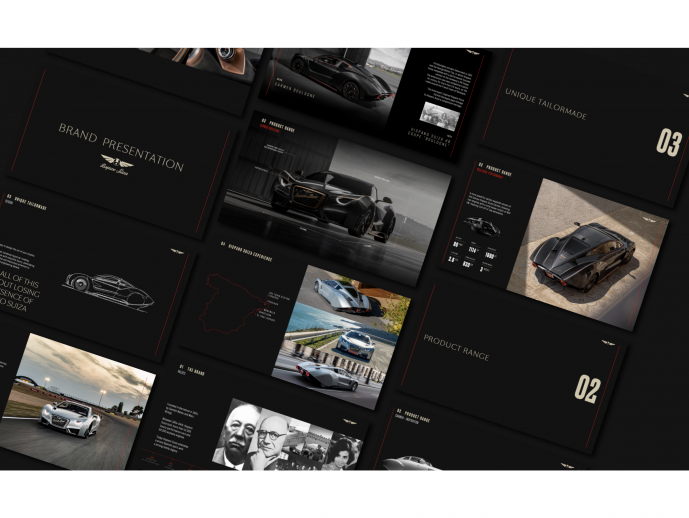
05/25/2023 by Hispano SuizaAfter relaunching the brand in 2019 and having turned the Carmen and Carmen Boulogne models a reality, Hispano Suiza is ready to start a new era. The company presents a new corporate identity that brings together its history and essence and, at the same time, embraces an exciting future led by technological innovation, sustainability and a passion for luxury, qualities that have defined, and still define, the brand since its creation.
New image, same DNA
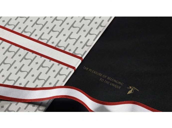
The history of Hispano Suiza, its powerful legacy, is something totally unique. Today, in the 21st century, the meaning or definition of luxury has changed, and the brand faces the challenge of reconnecting with contemporary icons. The new image has been inspired by two basic elements of the brand's structure. On one side is the concept of “hyperlux”, a term devised by Hispano Suiza combining the words “hypercar” and “luxury”. On the other, the new ethos: 'the pleasure of belonging to something unique'. Hispano Suiza was the brand of aristocrats, artists, and intellectuals of the 20th century, such as Albert Einstein, Coco Chanel or Paul McCartney, so the idea was to convey what the experience of having a Hispano Suiza meant, the experience of driving something so unique.
With such a strong set of icons and symbols, like the emblematic stork, the brand understood right from the start that they should not be modified but rather enriched, with a monochrome, more elegant and, of course, more digital approach. Finding a balance between heritage and future was of paramount importance. For this reason, the shield and the emblem of the stork had to stay, but be adapted to today’s digital environment.
From this idea arose the apparent dichotomy that defines the new brand image: the balance between luxury and exclusivity on one side, and the sporty and competitive DNA that has marked the history of the brand on the other. Two worlds so far apart that could seem incompatible at first, now come together in the new typefaces.
Hispano Suiza´s path to the future
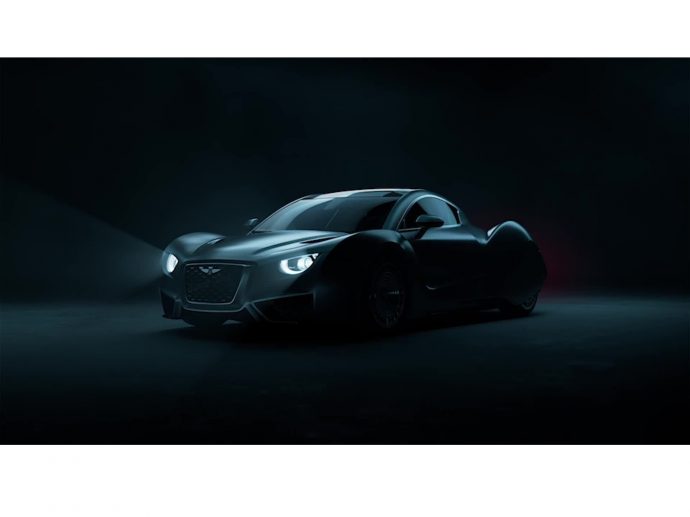
Hispano Suiza introduces today its new image that is transferred to the website (www.hispanosuizacars.com) and a new brand video. The Hispano Suiza Carmen, a symbol of excellence that transcends the automotive world, becomes the absolute protagonist of this production, where a spectacle of light and shadow interact with the energetic color red. This color, ELECTRIC RED, plays a special role in the new era of Hispano Suiza. It is the only color that the Spanish and Swiss flags have in common, therefore becoming a symbol of the company's roots.
Future Brand, a McCann Group agency, is behind the new Hispano Suiza corporate identity, whilst the video creative concept was developed by Daughter, a London based agency. Video production was handled by BAFTA, EMMY and GRAMMY awards nominee Untold Studios, specializing in music, television and audiovisual productions.
Sergio Martínez Campos, CEO of Hispano Suiza: “We are pleased to present the image of the new Hispano Suiza, more contemporary, yet purely Hispano Suiza, recognisable at first glance. After months of work, we are extremely satisfied with the results: we are taking a step forward without changing the essence of our exciting brand. We are delighted to enter this new era, one that will be filled with news and excitement!”
The firm continuously striving to improve and evolve is a testament to the perseverance of Hispano Suiza. The company continues to work with its sights set on new projects in the short, medium and long term.


